Design
7 minute read
11 Tips To Have the Best B2B Web Design.
LAST UPDATED:
June 13, 2023


Great businesses don’t just happen. They’re cultivated. But there’s one essential ingredient for any business owner who wants to thrive in their respective industry: a solid B2B website.
But how can you design a website that converts? After all, you need to ensure that all your investment doesn’t go to waste.
This blog post will discuss best practices in designing a B2B website that stands out.
One thing to remember is that B2B websites aren’t just like any other websites.
Unlike other websites, B2B sites are designed to build relationships with other businesses rather than individuals. It’s a place where your prospects can access information about your products and services, learn more about what you offer, and make informed decisions.
It is usually used to:
- Provide market information
- Display products and services
- Establish relationships with partners, customers, and suppliers
With a B2B website, businesses can increase their visibility to the right target audience while providing more simplified methods of communication. This allows them to create relationships exponentially faster and broaden their scope in the industry.
Furthermore, it helps foster a sense of confidence as customers are often reassured that the company has an easily-accessible online presence at their disposal.
Now that you know the importance of having a B2B website, here are 11 tips you should keep in mind when designing one:
1. Keep It Clean

Setting up an attractive but not over-the-top website is essential to creating an effective B2B website.
To do this, your web design needs to stay simple and clean. Too much information or graphics can quickly create a cluttered look and distract potential customers.
But don’t overlook the importance of white space!
Placing extra emphasis on margins and line spacing ensures there’s still some breathing room between elements like text and images, which goes a long way in creating an eye-catching page. An even balance between content and clean design will focus visitors’ attention on what matters — your product’s message!
2. Optimize for Mobile Devices
Think about how your target audience will use your website by making sure your website is optimized for mobile devices and by making that a top priority.
Our phones are an extra appendage these days, with more and more people connecting to the internet on their devices!
Having content that can be easily read and accessed on smaller screens ensures that your audience has a great experience while visiting your website.
Plus, having large font sizes or different font families makes it even easier to navigate and read — no need to zoom in or squint your eyes!
3. Use Your Website’s Navigation To Guide Your Visitors

Your website navigation should be designed with usability in mind.
After all, if visitors can’t easily find what they are looking for on your site, they won’t stick around for long!
A top-level navigation bar at the top of every page ensures your website visitors can easily find what they’re looking for.
Additionally, breadcrumbs provide visibility into how each page fits together with the rest of the website.
Think of your B2B website as one big sales journey — make sure you build a bridge between site users and potential customers that’s visible and easy to understand!
4. Clear Call-to-Actions (CTAs)
Getting someone to your website is only the first step. Once they’re there, you want them to take action and interact with it.
This is where calls-to-action come in: strategic ideas such as contact forms or clickable buttons on your website that guide visitors towards taking action.
A website’s purpose should be immediately evident to visitors, and these CTAs should help guide them along their journey.
Plus, ensuring that all critical pages, such as contact information and services, can easily be accessed through the menu or homepage will increase user satisfaction.
5. Images Speak More Than Words

Have you ever heard the old cliche that a picture is worth a thousand words? Well, it has proven to be true in many different contexts.
For websites, images can help to draw people in, keep them interested and provide more information than words alone can.
High-quality images are crucial for websites because they display professionalism, break up text and improve the overall design of your B2B website.
Remember to be creative in your choices to instantly capture visitors’ attention and make them want to stay on your site longer.
Let the pictures do the talking. They’re worth much more than a thousand words!
6. Make Reaching Out and Connecting Easier for Your Audience
Customers shouldn’t have to go hunting for your contact info. Displaying your phone number and email address prominently on every page makes sure customer service inquiries get swiftly answered.
B2B visitors will also appreciate the availability of a live chat feature, where they can quickly receive answers to frequently asked questions such as pricing and product availability.
Contacting you should be a breeze, so place contact forms strategically throughout the pages.
Also, why not put social media icons in a prominent spot so visitors can tell how awesome you are?!
7. Use Testimonials

Social proof is one of the most vital selling points in your marketing tool belt, and using testimonials is an excellent way to get the job done.
They can help build trust and credibility with visitors, significantly improving conversion rates.
Plus, it gives potential customers a great way to learn about your business from people who’ve already been successful.
There’s something special about seeing reliable feedback from real customers that nothing else can compare to.
Whether through reviews or success stories, customer testimonials can turn doubters into buyers.
So if you’re looking for a reliable tool to put your marketing results over the edge — you know where to look!
8. Check Your Links
If you don’t want your website visitors to end up on Linkbender 9000, ensure all your links are functioning well!
Take a few moments now and then to check that the links on your site are working correctly.
Not only do broken links look messy and are a massive buzzkill when clicked on, but they can also harm the user experience.
That’s why it’s vital to proactively test internal and external links often, and update or remove them if necessary.
To ensure your users have an enjoyable experience on your website, stay on top of dead ends by ensuring all your links lead to up-to-date content.
9. Include Proper Internal Linking

With internal links, your visitors stay more engaged with your content and spend more time on your site.
Not only that — it can significantly boost your website’s SEO credibility and ranking.
By creating enough links between pages, search engines can see how related these pages are so they understand which topics are essential to show when people search online.
Let’s not forget that internal linking helps visitors navigate your website more easily.
So it’s a win-win situation: better rankings and happier user exploration all in one fell swoop.
10. Keep Your Blog and News Feed Fresh
Incorporating fresh content into your B2B website design is a great way to keep it up-to-date and relevant and add some pizzazz.
Whether you prefer to produce blog posts, news articles, or even video tutorials for your audience, this type of content proves that you’re knowledgeable in the field and always caught up on the latest industry trends.
Adding that to regular updates will drive traffic to your B2B website, help with search engine optimization, create an image of authority, and boost customer engagement — what’s not to love?
Keeping your blog chock full of valuable content isn’t just a smart business move, it makes potential customers fall head over heels for your brand too!
11. Test, Test, and Test Your Website

It’s essential to test, retest, and then retest again!
Before launch, test your website on different browsers and devices to ensure the user experience is seamless for everyone.
After launch, keep up with the testing by using analytics tools to track user behavior and identify possible problems.
Of course, grabbing a few friends, family, or colleagues for feedback about your website doesn’t hurt.
After all, another set of eyes can help spot any opportunities for improvement you may have missed.
Your B2B website is like your online shop window — it needs to look good and be easy to use if you want customers to come in and look around.
Following the tips in this blog post, you can ensure that your site is up to scratch, and ready to attract (and convert!) those all-important leads.
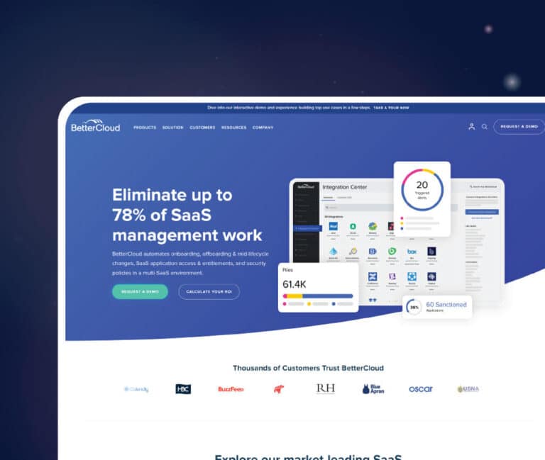
And, if you need inspiration, you can check out these B2B website examples anytime.
Huemor is here to help with all your B2B web design and development needs.
We specialize in building custom websites that are visually appealing, functional, and user-friendly.
So, contact us today to get a top-notch website that will wow your visitors and convert them into leads!
Author
Jeff Gapinski is the President of Huemor where he helps plan the long-term strategic growth of the agency. Jeff is passionate about UI/UX, demand generation, and digital strategy.
What Do You Think?
Have feedback? Maybe some questions? Whatever it is, we'd love to hear from you.


No comments found