Design
12 minute read
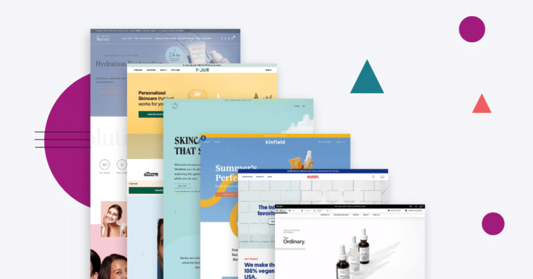
Our 20 Top Beauty Websites and Why We Love Them.
LAST UPDATED:
June 21, 2023


Beauty might be in the eye of the beholder. Of course, the same is not true when talking about best beauty website design.
Here, beauty brands have to follow a few central design best practices. The competition in the beauty space, especially when it comes to beauty ecommerce websites, is fierce. Standing out is crucial to make sure they attract, convince, and help their audience navigate the website.
The general purpose of all of these beauty websites is simple: attract your audience’s eye, then guide them to the product page to make sure they convert. To get there, anything from the homepage to the about us page and even the footer design has to work perfectly in concert.
Fortunately, you’re not on your own.
In the past few years, we’ve helped brands like Gleamin, Alodia Haircare, Briogeo, and CoverFX make a name for themselves online. Now, we’re bringing that expertise to you.
The below beauty website examples are handpicked by our team for a variety of reasons. They stand out for reasons that range from colors to navigation. Together, they serve as an inspiration for any beauty brands’ ecommerce website to begin standing out.
1. Glossier

At first glance, Glossier’s website is simple, aesthetically pleasing, and easy to navigate. Large images showcase the product on its own and on a model, while pink colors perfectly match the brand. A clean, natural look is a perfect match for this industry.
With Glossier, navigation is not reduced to the main menu. Holding your cursor over a category brings up the top options within that category, previewing exactly what the user is looking for. Bundling products makes for a more straightforward online shopping experience.
In short, simplicity is key. The fact that the branding is consistent and strong throughout only helps to make this a site that fully leans into its brand and maximizes its potential.
2. Avene

This skincare site leans fully into its brand. It wins by approaching the online experience from the user’s perspective, allowing for shopping experiences based on skin concern and even a naturally flowing skincare regimen quiz.
Of course, advanced users can still opt for a more traditional online shopping experience to find their preferred skin care category or product collection.
We’ve emphasized the importance of category pages in the past, and Avene fully leans into them. Every product shows a list of benefits, available on-demand through a drop-down menu. And if you’re not quite ready to shop yet, the site’s “Skintelligence” blog is ready to educate you and provide add-on value while showcasing their expertise in the skin care industry.
3. 100% Pure

Talk about a top beauty site that shines through aesthetics.
The appearance is as the brand name suggests: bright colors, but without being too flashy, catch the eye without being annoying. Meanwhile, menus with background pictures of the actual products add a fun touch to the navigation without compromising readability.
The shopping experience is still front and center here. An under $25 section appeals to budget shoppers, while a chat feature helps with anything from making a decision to potential check-out issues.
Once you get to the product pages, you find in-depth videos and information on how to apply the product, keeping the focus on education. But 100% Pure is not afraid to lean into its brand, either; a philanthropy site helps to communicate that when you shop here, you help to make a difference.
4. Winky Lux

Now here’s a homepage to be proud of. It follows a bunch of our ecommerce homepage best practices, from a rotating and engaging hero image all the way down to the bright colors and navigational ease through category pages featured right on the home screen.
It doesn’t stop there, of course. Throughout the site, subtle animations are just enough to keep audience interest without becoming distracted. They make sure that the products pop and always stay that center of the experience.
Winky Lux shines in its shopping experience, too. The checkout page design (again following our best practices for checkout pages) is clean and straightforward. Before you get there, it’s easy to add items to a wishlist before making a buying decision, and even seeing what products pair well with others on the individual product pages.
Protip
The best Beauty websites have beautifully branded homepages, much like the one for Winky Lux! They are organized with a clean design making find key information a breeze. Check out our article for more tips on how you can create an amazing ecommerce homepage.
5. Rare Beauty

One of the main drawbacks of shopping for beauty products online is not being able to see what they look like on your skin through a website. Rare Beauty circumvents that, through an innovative shade finder tool and filters from finish to coverage that are indispensable in finding the right product for each person.
These tools integrate naturally within the larger site, which is clean and almost feels delicate — a perfect match for a beauty brand. Featuring customers who have tagged the brand on social media is a great touch to bring in peer recognition, showing the product in action and in the real world.
Like others mentioned in this list, Rare Beauty is not afraid to show off its societal causes. A mental health blog on the site connects directly to the fact that a percentage of each sale supports the same cause, staking a claim beyond just technical product quality.
6. The Ordinary

Where most beauty brands go classic, The Ordinary leans into the modern. A sleek, simple color scheme connects perfectly with an innovative use of shapes and angles to make for a unique experience in this space.
The hero image rotates through, but the ability to hit pause to learn more about a product featured at any time is a plus. So is the plus button that allows you to jump straight from hero to a product page.
Not sure what you’re looking for yet? The Regimen Builder can help you build your own skin care routine from the ground up. On the individual product pages, meanwhile, a technology section teaches users about each product, ingredients, and how they interact with your skin.
7. Your Skin

As soon as you get to the homepage, you notice something unique. The color scheme here is not bright or even modern, but subdued and natural. What might not work in other industries is perfect here, for its natural implications and the uniqueness compared to other skincare brands.
We also love the navigational cues on this page. Arrows lead you exactly where you need to go, never leaving you feeling confused or lost. Frequently featured customer reviews and quotes, from the homepage to category and product pages, leave no doubt on whether you should convert.
For a brand called Your Skin, it should not come as a surprise that the skin quiz is highlighted prominently throughout the website. The trick here, of course, is that it never feels obtrusive or annoying.
8. Wholy Dose

The use of shading on the homepage’s hero image is in a class of its own. It also foreshadows the entire site, which uses simple lines and grey tones to convey a feeling of being clean and straightforward.
Wholy Dose is not afraid to stand behind expert recommendations on its homepage, which gives it an instant feel of credibility. Meanwhile, a band of the brand’s Instagram posts brings in the social engagement piece, connecting on the peer level with the audience as well.
Looking for unique features? The product page includes recipe ideas that match perfectly with each product. The company’s blog, meanwhile, features plenty of categories to read about, set up in a clean and brand-consistent way to streamline the user experience.
9. Plenaire

Scroll down the homepage, and you’ll come across something far more natural than most websites: imagery that seems to be arranged randomly, without fitting into any particular grid.
That, plus a light purple and blue color scheme, provides it a feeling of openness that few other beauty sites can offer. It also flows through to its skincare category page, where words like clean, energize, and relax float seemingly randomly across the page to help make the point.
Beyond that, subtlety is the name of the game for Plenaire. The buttons are simple, the homepage animation is barely there but still draws the eye. The lines are clean, and the font is minimalist. In other words, the full focus is on the product at all times.
10. Carbon Beauty

Beauty websites tend to be complex, so scrolling is inevitable. Carbon Beauty shows how to take advantage of that fact.
It starts with a dynamic and bold hero image. From there, the scroll experience here is nothing but positive. Large, bold text moves along with the images, creating a dynamic effect that builds interest and excitement. Even getting to the bottom works well, with a footer that catches the eye and allows for newsletter subscriptions without having to leave the page.
The combination of excitement and simplicity extends beyond the homepage. Everything has movement to it, including category pages that change in design depending on mouse hovers.
11. Garoa Skincare

As with the prior two beauty website examples, Garoa has paid special attention to its animations and scrolling experience. Beginning on the homepage, it’s more than just vertical movement, with horizontal elements entering the picture and dynamic text interacting with images.
That experience, as with Carbon Beauty, moves through their category pages as well, building a feeling of consistency. All of it fits within an earthy and authentic color scheme that matches the brand exceptionally well.
Garoa’s value proposition focuses on skin care for every season, and its website is sure to highlight that fact. The brand effectively brings in a secondary educational component by mentioning that all ingredients come from Brazil, and the benefits of that process.
12. Hetime

Hetime is a simple, two-product brand with a unique angle: skin care for men. Its branding clearly reflects that fact, with a dynamic aesthetic and photography designed to stand out immediately.
At the beginning of the homepage, the hero image blends directly into the rest of the content through curved, wavy lines that naturally directs audience attention to the more detailed information. Both products are featured in detail on the homepage, a natural fit for a simple company without complex categories.
For all the details, the product page sets up similar category leaders in other industries, like Apple. Both products are shown side-by-side, showcasing their similarities and differences. It’s a mix of simplicity and functionality that other brands will do well to emulate.
Protip
What makes a great ecommerce or specially a great Beauty website? The product page! They highlight the products with consistency. Check out our article for more tips on how you can craft a great product page.
13. Frank Body

“Hey babe, I’m Frank Body.” The page title of the homepage previews just what makes this website so unique and engaging. Playful copy, from the hero all the way to the theme of the rewards page and the word bubbles for individual featured products, immediately establishes the feel this brand is going for.
That feel carries through to the aesthetic in all shapes and sizes. The fonts stand out from all other beauty sites we’ve examined, and the color scheme makes every piece of the site welcoming and engaging.
That’s not to say that the educational component pulls up short, though. Category page graphics highlight core benefits of each option without using too many words. Meanwhile, linking to the brand’s YouTube account in relevant spots allows Frank Body to show more product details without crowding up limited website space.
14. Kinship

At first glance, it doesn’t feel like any other beauty site. The personality, youthful feel, and glowy vibe of the images makes Kinship stand out immediately, with a font and tan background that blend in naturally and take full advantage of the brand’s visual palette.
That’s not to say that user experience takes a backseat. It still includes everything an e-commerce site requires.
The homepage allows for easy swiping of products in a visual, engaging way. Meanwhile, strategic design elements, like a moving collage of the brand’s Instagram posts, highlights product benefits while encouraging cross-channel user experiences.
15. Huron

Much like Hetime, Huron’s audience makes this website inherently different. A beauty product directed towards men, its website feels masculine without exaggerating the process or turning it into a cliche.
Part of Huron’s value proposition is that its product is made in the USA. But rather than throwing that fact into the audience’s face, it communicates the fact more subtly through its red, white, and blue colors.
In all, it’s a clean experience matched perfectly to its audience and the look of its products. Slightly offset background squares make the images and the product they feature pop, while showing the savings of buying more than one product is a natural and non-intrusive upsell opportunity.
16. Kinfield

Here’s a brand that commits to its look. The squiggly line that’s so prominent on its products shines through on the website as well, incorporated into all layout as both an interesting design element and a cue to continue scrolling.
Even headings and words start taking the same shape, while the photography adds to the fun and natural look through a great balance of lifestyle and featured products.
Finally, the footer (distinguished by the same squiggly shape, of course) is both personal and direct. It feels like a part of each page it’s on, despite containing all the typical footer information required. That sort of continuity maximizes the chances of audiences paying attention.
17. Gleamin

In the beauty industry, online and product experience are closely connected in the audience’s eye. Gleamin takes advantage of that fact, with a bright yellow clearly tying website and products together. It matches beautifully with the bold blank homepage font on top of the yellow, exuding confidence and boldness.
That’s not to say that user experience takes a back seat. A before and after category page allows users to recognize their problems in the experience of others, finding the right product solutions. Throughout the homepage and website, real customers using the product while reviewing it adds authenticity and credibility.
This website sells a single product, and it doesn’t try to overcomplicate things. That simplicity keeps the focus on what matters most, creating a streamlined, straightforward experience.
Protip
Shameless plug! Check out our case study on how we helped Gleamin create an amazing website.
18. Bésame Cosmetics

Where many beauty websites go modern, Bésame Cosmetics one goes vintage. Starting with the homepage, our reviewers can’t help but think of old Hollywood glam, and all the elegance that comes with it.
That feeling carries through from the color scheme to the fonts and even the navigation, which is organized like a classic beauty site with categories like lips, eyes, face, and so on. It’s nothing if not straightforward.
That classic elegance, of course, doesn’t prevent modern features from shining through. The website’s chat feature is excellent, and so is the educational blog that’s linked straight from the homepage. The historical focus of featured posts tie it all together as a vintage beauty experience.
19. Essie

Navigational menus aren’t typically described as “fun”. This one, though, qualifies. Scroll halfway down the homepage, and you’ll see rounded-off squares that visualize exactly what each category page will look like.
Once you get to the category page, the same style carries through, building consistency in the process.
Our favorite feature, though, is the Virtual Try-On section. Upload your hand’s image, and you can see exactly what different shades of nail polish would look like with your skin tone. It’s a unique and engaging way to leverage augmented reality in a way that actually helps make buying decisions.
20. Function of Beauty

This website presents almost every color in the rainbow. Somehow, though, it’s able to do so without appearing tacky or overwhelming. Instead, the variety of colors emphasizes the brand’s unique value proposition: the customizable feature of its products.
Two more features stand out in this pastel bright and clean website. First is the quiz to take before seeing products, removing irrelevant options from the consideration set and immediately narrowing your options. Streamlining is good!
The second is a clear variation between the brand’s two product lines, skin care and hair care. Function of Beauty changes fonts when talking about each, introducing subtle differences that keep them separate while still presenting them as part of the same brand.
Conclusion
The beauty industry is complex, so it stands to reason that the beauty website examples showcased here range widely. Still, each of them offers great inspiration for how to build your own website in a way that attracts, engages, and converts your audience.
Over to you. Do you know of any top beauty sites that stand out? Or maybe you have feedback or questions about what truly makes for a great website? Comment below to let us know.
Author
Jeff Gapinski is the President of Huemor where he helps plan the long-term strategic growth of the agency. Jeff is passionate about UI/UX, demand generation, and digital strategy.
What Do You Think?
Have feedback? Maybe some questions? Whatever it is, we'd love to hear from you.


No comments found