Design
12 minute read
20 Best SaaS Websites of 2022 and Why They Rock.
LAST UPDATED:
June 21, 2023


Since 2019, software as a service (SaaS) has become one of the fastest-growing market segments in the world. In fact, Statista reports that the SaaS market is estimated to be worth approximately $123 billion as of 2021 and is expected to reach $145 billion the following year.
It is clear to see that the demand for B2B SaaS providers is increasing. With this growing demand comes a need to ensure that brands put out the best SaaS web design they can to stand out.
In such a competitive market, it is essential that brands put their best foot forward with a website design that is both user-friendly and visually appealing. Fortunately, there are a number of web design trends that brands can incorporate into their SaaS websites in order to make them stand out from the rest.
If you’re already familiar with what ‘SaaS’ is, then feel free to skip right past the next part and jump into the list.
If you’re unsure what this acronym means, then let us take a quick moment to level-set a bit so we’re all on the same page.
What is SaaS and what are SaaS websites?
‘SaaS’ is an acronym that stands for ‘Software as a service’. Companies will create software that solves unique challenges within a marketplace, and then offer a license to that software for a fee.
SaaS products have transformed how we do business today. They eliminate complexities and allow smaller businesses to maintain more sophisticated operations at lower costs. The era of huge R&D projects to develop proprietary software has been eliminated in many fields because of this.
(Bad for software developers maybe, but good for everyone else )
An effective SaaS website is meant to communicate the value of the SaaS company by highlighting its unique product features. They also serve as the primary sales driver for most companies.
At Huemor, we have helped dozens of companies develop unique and memorable SaaS websites that provide their customers with best-in-class user experiences. In that time, we’ve started to see the patterns of what works and what doesn’t. The best SaaS websites have the following elements:
- Help convert visitors into customers (or at least into demo requests)
- Feature intuitive user flows that guide visitors along a desired path
- Function as lead generation machines for their companies
- Align with their company’s overall marketing strategy
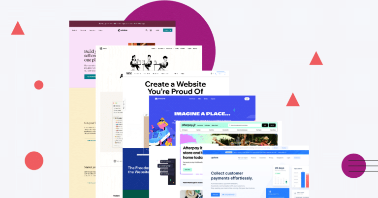
Below is a collection of our ‘short list’ of website development examples we often come back to that always seem to inspire. From clean and minimal designs to more complex and interactive B2B SaaS website experiences, these websites represent the best of the best in SaaS design.
Alright, so let’s get to it.
Some SaaS Website Inspiration
In a world where a lot of SaaS websites look the same, here are our favorite unique and well-crafted SaaS sites.
1. Google Drive

Google Drive is at the top of this software as a service website examples list, and rightfully so. Not only does it provide a free cloud storage solution, but it is also easily accessible to any user and across multiple devices.
Teams can seamlessly collaborate on tasks, plans, and projects using the full-featured office suite from Google Drive. Finally, its straightforward UI design makes it incredibly user-friendly even for newbies.
2. GitHub

GitHub is a public code repository that provides a great user experience on both desktop and mobile devices. Users can create their own code, share it with others, and explore other code repositories directly from their browsers.
GitHub’s design is simple and straight-forward, with easy user flows. The interface is clear and easy to navigate, making it a great tool for developers of all experience levels.
GitHub allows teams to collaborate on open-source applications or even let solo developers build and post their side projects online.
3. MailChimp

The SaaS website design of MailChimp contains amazing illustrations of the features that you can expect from the email marketing platform. It uses fonts and colors that are not what you would normally expect from a standard SaaS platform.
Apart from that, the MailChimp website also uses white space and spacing in general well, which helps prevent that feeling of being crowded.
Overall, the design of the MailChimp website is excellent and definitely helps to set it apart from other digital marketing platforms.
4. Attentive

The Attentive website features awesome colors, a clear call-to-action for visitors, and crisp UX writing. Visitors can immediately see the value that the platform can provide for their needs.
Upon visiting the software as a service website, you will be greeted with bold colors ranging from bright yellow to soft baby blue. The fonts that they use are also eye-catching, making it easy for users to read all of the text. Their “about us” page design is awesome as well! We really like how they use different design elements to highlight their company’s value propositions.
Attentive provides a great example of what a SaaS homepage should be.
Protip
The best SaaS websites use their about pages as an opportunity to humanize their brand. These pages highlight leadership, the team, accomplishments, and outings. Our about page design article describes how to craft an about us page that places your brand in the best possible light.
5. Notion

Notion is one of those project management websites that lets you organize your notes the way you want them. All of the notes here are block-based and you can convert them into different styles through drag-and-drop capability. This makes it easy to rearrange notes and create custom layouts. In addition, the UX/UI design is clean and intuitive, making it easy to navigate the app.
Besides the clean designs, what we really like about Notion is that it uses emojis as a tool to outline key features. You won’t expect a wordy table of contents or sitemaps from this SaaS site. Website visitors know exactly what to expect.
6. Stripe

We often use Stripe as one of the best SaaS website design examples because of how its web design standard techniques are both effective and unique for its users. Despite not being overloaded with text, you can still feel that the interface is very comprehensive.
Besides that, the website has a good information hierarchy as well as interesting animations for its icons and gradient pool.
7. Pitch

We really enjoy the purposeful animation that they put up on their website. They are a great example of doing B2B website design in a way that not only draws attention to the right interactions but also enhances the overall user experience.
In terms of aesthetics, its UI design is very modern and crisp. The website also uses white space extremely well which is always a plus.
8. Crossbeam

The color palette that Crossbeam uses from the homepage alone makes their website design stand out while keeping everything looking extremely neat. In fact, the overall layout of their SaaS website is incredibly well done.
All of the graphics that they have used on their website help let their target audiences know what Crossbeam is all about. Meanwhile, their page on case studies does a great job of highlighting the previous experiences their users had with their service. As a result, Crossbeam is able to generate more business thanks to this social proof.
9. Slack

We use Slack as one of our go-to communication tools for a reason. The website itself lets you easily choose between installing their app on your desktop or mobile device.
One of the best things about Slack is the “magic link” that the system generates, allowing users to log in on new devices without having to input their passwords.
10. Wix

Wix offers the ultimate web hosting service to users, and they make their value clear from all of their website’s pages. Comparing Wix to its competitors, you can easily find and use the tools you need to get started with your dream website here.
11. Help Scout

It seems like having good animations is a characteristic of the SaaS website design examples that we’ve listed here, and Help Scout hews to that mold. As a result, they’re able to effectively capture user attention and communicate their message clearly.
The homepage design of the site copy answers the basic questions visitors have about the brand’s software product while still redirecting them to important pages that could answer their questions in-depth.
12. Toggl

The animated hero image on the Toggle website landing page is definitely engaging. We like how well they incorporate all of the colors that they use in their color scheme without making the site look awkward.
13. Discord

Discord has overtaken Skype in terms of being the superior communications app today. Many people around the world use it to connect with their friends and even collaborate on projects online. The Discord web design is distinctive and complementary to the design of their mobile app.
14. Afterpay

The Afterpay website is very intuitive and makes it feel like you are shopping in a retail establishment. Despite having a simple design, they make visitors feel that they want to purchase related articles here and make use of the Afterpay service.
15. Upflow

Not only is Upflow one of our top picks for best homepage design but we pick them as one of our top overall websites UX designs! The Upflow website is one of the standard-bearers of the modern SaaS website.
You can find a clean interface that easily presents their software to site visitors. Upflow also has a great service page where they highlight their services in an easy way for users to find exactly what they want in a short amount of time.
Protip
Service or product landing pages need to do more than just explain what your software does, they need to explain how it addresses the needs of your prospective customer. Check out our article on service page designs to find out how you can accomplish this yourself.
16. Loop Returns

The simple yet clean color palette mixed with a bold layout used by Loop Returns in their website makes it stand out by providing visitors with truly striking web design inspirations.
The Loop Bot live chat feature is a great addition since it lets them communicate with potential customers without being a hindrance to their browsing experience.
17. Intuit Mint

The Mint website homepage is designed to appeal to its target customer – busy adults who are looking for a simple and straightforward way to manage their finances.
The Mint website homepage is interesting because it immediately greets visitors with a simple yet appealing color palette along with a clean design that makes for seamless navigation. Accessing information you need on the website is also easy to do.
18. Speechly

Clean messaging and navigation are two of the characteristics that stand out for us from the Speechly website. We also really liked the demo feature because you get to play around and book flights by simply using your voice.
19. InVision

InVision is a SaaS site that has been on our crosshairs for quite some time now. We’ve noticed that they are constantly updating their website, so there’s definitely some testing going on to ensure their visitors get the best user experience possible.
20. Shopify

What we really liked about the Shopify website design is the globe animation on its homepage as it really shows what the platform can do. We also love how they give you a glimpse of selling, marketing, and managing products all from the Shopify homepage.
The Best SaaS Website Design for 2022
These are the top SaaS website examples that we’ve compiled to give you inspiration and an idea of how to design your own. We noticed that the best SaaS website designs leverage simplicity a lot, so this is definitely something you want to consider moving forward.
By studying how these SaaS companies design their website, you can also create an engaging and high-converting SaaS site.
What do you think? Do you agree with our list of the best SaaS website design sites?
Let us know your thoughts, and tell us if you have a different great example of some solid SaaS website design that could inspire our business!
Want your SaaS website to be amazing in 2022? Talk to us about our website redesign services.
Web Design Resources for SaaS and Technology Brands
Thinking about improving your SaaS company website design? Here are some additional resources and information. If you have further questions don’t hesitate to reach out.
Questions about the best enterprise SaaS websites?
Here we cover common questions about SaaS websites, and share what we’ve learned over a decade of web design and development.
Which is the best SaaS platform?
There are many different SaaS platforms available, so choosing the right one for your business can be tricky. Here are some things to consider when selecting a SaaS platform:
- Ease of use: How easy is the platform to use? Can employees quickly learn how to use it, or will there be a steep learning curve?
- Pricing: How much does the platform cost? Is it affordable for your business? Are there any hidden costs?
- Features: What features does the platform offer? Does it have everything you need? Are there any extra features that would be beneficial for your business?
- Integration: How well does the platform integrate with other software and systems that your business uses? Will you need to do any extra work to get everything up and running smoothly?
- Support: What kind of support does the platform offer? Is there 24/7 customer service available if you encounter any problems?
What is a SaaS website?
A SaaS website is a website belonging to a SaaS brand (a company that allows users to access and use their software for an ongoing fee).
One of the main advantages of SaaS is that it can be accessed from anywhere in the world, as long as there is an internet connection. SaaS subscriptions are also typically more affordable than desktop software, as users only have to pay for the subscription, rather than buying a license outright.
SaaS websites also tend to be more user-friendly than desktop software, as they are designed to be used via a web browser.
What should a SaaS website have?
SaaS, or software as a service, is a subscription-based model for software that delivers access to a cloud-based application.
SaaS websites need to be designed with conversion in mind, as the goal is to get visitors to sign up for a free trial or paid subscription.
To that end, SaaS websites should have a clear value proposition, prominently displayed on the homepage. The site should also include a pricing page that outlines the different subscription plans and features.
Additionally, SaaS websites need to have strong calls to action, as this is what will prompt visitors to take the next step and sign up for a demo, a free trial, or a paid subscription.
What is an example of a SaaS?
SaaS is a software as a service delivery model. It is software offered by the provider on the web.
SaaS is also a category of cloud computing. Cloud-based SaaS applications are provided over the Internet and accessed from web browsers. SaaS provides an alternative to traditional, on-premises software installed on local computers.
SaaS vendors typically provide online access to their applications at no charge for limited use, with additional features available for a monthly or annual subscription fee.
SaaS applications are used by businesses of all sizes and in many different industries. Some of the best SaaS companies include Adobe, Microsoft, Salesforce, DropBox, and Slack.
SaaS applications can be deployed quickly and easily, without the need for complex infrastructure or IT support.
SaaS can help businesses save money on hardware, software, and IT support costs. SaaS can also improve business agility and allow businesses to respond quickly to changes in market conditions.
Further Reading On SaaS Website Design and Development.
Looking for SaaS web development and design inspiration? These articles should help.
- Metrics Product Teams Can Use To Improve UX
- Key UI/UX Terms You Should Know
- Our Enterprise Web Design and Development Process
- Setting The Right Lead Generation Goals
- Avoid These Website Redesign Mistakes
- Our Page Speed Optimization Services
- How We Optimize Website’s Conversion Rate
- Quick Wins to Improve Your Website
- Our Web Design Process for Startup Companies
- Our Ultimate Website Launch Checklist for 2022
- Our Approach to Drupal Website Design
- Our HubSpot Website Design Process
- Website Footer Design Best Practices
- Our WordPress Website Design and Development Process
- 24 Great Website Examples for 2022
- Examples of Winning B2B Websites
Author
Jeff Gapinski is the President of Huemor where he helps plan the long-term strategic growth of the agency. Jeff is passionate about UI/UX, demand generation, and digital strategy.
What Do You Think?
Have feedback? Maybe some questions? Whatever it is, we'd love to hear from you.


No comments found