User Experience
7 minute read
What Is Accessibility and What Does That Look Like for Web Design and Development?.
LAST UPDATED:
June 13, 2023


Your website is like a house party — you want everyone to be able to come in, mingle, and have a good time.
That’s why accessibility is essential — it allows all users the same opportunities to access and enjoy your website.
Whether adding alt text to images for those with visual impairments or providing closed captioning for videos, minor tweaks can make a big difference in ensuring that your site is inclusive and welcoming to all.
Plus, making your site accessible can help you reach a wider audience and improve your search engine ranking.
But what does having an accessible web design mean? And what does it look like for most users?
This blog post aims to give you a comprehensive understanding of web accessibility.
By the end, you’ll know what it is and how to use various practices to make your website more accessible.
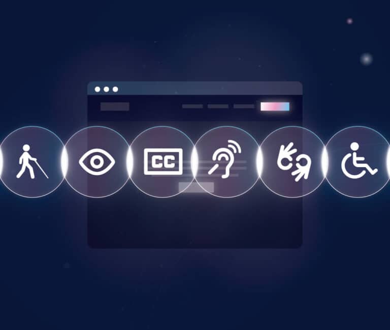
When it comes to the world wide web, the term “accessibility” refers to the degree to which users can access and use web content.
In other words, it’s about ensuring everyone can surf the internet, regardless of ability or circumstance.
This includes people with impaired vision, hearing, motor skills, or cognitive abilities.
It also includes those who use assistive technologies like screen readers or voice-recognition software.
One of the main ways to ensure accessibility is by using the Web Content Accessibility Guidelines (WCAG).
These guidelines are developed by the World Wide Web Consortium (W3C), providing a comprehensive framework for making websites more accessible.
One of the critical concepts behind WCAG is the POUR acronym:
- Perceivable: The content on your site must be accessible for users to understand and see. This includes all forms of media, from text to videos and images.
- Operable: All users should have access to every feature on your site. This includes items such as navigational elements and form fields.
- Understandable: Users should comprehend the content on your website, which encompasses not only the written text but also any visual indicators (e.g., icons).
- Robust: Your site must be compatible with assistive technologies so that all users, including those with disabilities, can access your content.

In other words, web content should be easy to perceive, operate, and understand, as well as robust enough to work with assistive technologies.
By following these guidelines, website owners can help ensure everyone can enjoy their content, regardless of ability.
Now that you understand what accessibility means for your website, it’s time to learn how to incorporate those principles into your web design and web development processes.
Making sure your site is accessible involves following best practices for coding, testing, and overall design.
Here are some of the most critical accessibility elements to keep in mind for your website.
Keyboard Inputs
Have you ever been surfing the web and thought, “Man, I really wish I didn’t have to use a mouse to click on everything”?
No? Just us?
Well, accessible websites allow users to use the keyboard for website functionality rather than just relying on a mouse to navigate the website.
This allows users to navigate through your website without using a computer mouse.
For example, they can use the tab key to move between various elements on a page and the enter key to select an element.
Furthermore, they can also use shortcuts like “Ctrl+F” to find specific content on a page.
Screen Readers Accessibility
Screen readers are used to reading various web pages to the user by converting the text on the page into a synthesized voice.
The most common type of screen reader is a text-to-speech program that you can run on a personal computer or a mobile device.
These programs are designed to work with various web browsers and operating systems.
It is essential to keep screen readers in mind when developing a website. This means designing your website efficiently for a screen reader to navigate.
For example, use clear and concise text and ensure that all links are clearly labeled. Avoid using images that rely on color to convey meaning.
Alternative Text for Images, Graphics, and Videos

Alt text, or alternative text, is the written content that appears in place of an image on a web page if the image fails to load on a user’s screen.
It’s sometimes referred to as “alt tags” or “alt descriptions.”
While alt text may seem like a minor detail in the design of a website, it’s an essential factor in creating an accessible site for all users, including those with visual impairments who are using screen readers.
In addition to being essential for accessibility, alt text also plays a role in SEO (search engine optimization). That’s because search engines scour the internet for words and phrases that help the deliver relevant results to users.
When they see images on a website, they look to the alt text to understand what the image depicts.
Therefore, including descriptive alt text can help improve a website’s ranking in search results.
Conveying Key Information
When designing forms for your website, it’s crucial to think about how to make the form fields as user-friendly as possible.
One way to do this is to use an asterisk in your forms. By including an asterisk next to the required fields, you can help people who may have difficulty understanding your form.
In addition, using an asterisk can help people who are using screen readers navigate your website.
By making your key information more accessible, you can help improve your website’s overall usability.
Clear Navigation
Have you ever been on a website and needed to know where you were or how to get where you needed to go, but nothing makes sense? It’s incredibly frustrating.
Well, that’s how your users feel when they can’t navigate your site.
If you want people to stay on your site and keep coming back, prioritize your website navigation.
That means having clear headings, breadcrumbs, and a consistent web design system.
When people can easily find their way around your site, they’re likely to stick around and explore all the amazing content you offer.
Ditch the confusion and make your site easy to navigate.
There are several reasons why accessibility is vital for your website.
Improves Your SEO Rankings
Firstly, it can have a direct impact on your SEO rankings.
Google has stated that they take web accessibility into account when determining where to rank a website in their search results. If your site isn’t accessible, you could miss out on valuable search traffic.
Additionally, if you’re not making your website accessible, you could alienate a large portion of your potential customer base.
Approximately one billion people worldwide experience disability, and if your site isn’t accessible, you’re excluding them from being able to use it.
Ensures Legal Compliance

Another reason accessibility is essential is that there are laws that require websites to be accessible.
The Americans with Disabilities Act (ADA), passed in 1990, prohibits discrimination against people with disabilities in all areas of public life. This includes websites.
While the ADA doesn’t specifically mention web accessibility, several court cases have found that websites need to be accessible to comply with the ADA.
Making your website accessible doesn’t need to be a difficult or time-consuming task.
There are several resources available that can help you make sure your site is compliant with the latest accessibility standards.

One of the most important things for us here at Huemor is to ensure that all websites we work with are inclusive and accessible to everyone.
However, we recognize that only some tools in the market today empower companies to do that.
That’s why we love AccessiBe so much.
It’s what we use for our website development and design projects to help us ensure that your websites are not only great but also compliant with accessibility guidelines from the authority.
Emphasizes Inclusivity
In an age where corporations are (rightfully) being held accountable for their lack of diversity and inclusion, ensuring that your website is accessible to everyone is more important than ever.
That’s precisely what AccessiBe does.
By automatically adding accessibility features to your website, AccessiBe ensures that everyone can use and enjoy your site, regardless of their abilities.
This is important because we believe everyone should have equal access to information and content online.
Helps With ADA and WCAG Compliance
Even though AccessiBe is not focused on ADA compliance, it does still help with both ADA and WCAG compliance.
This is because the tool automatically adds alt text to images on your website, which is one of the requirements for WCAG compliance.
In addition, AccessiBe provides a wide range of customization options so you can tailor the tool to meet the specific needs of your visitors. This makes it easy to meet all of the ADA requirements for website accessibility.
Easy To Use
We also love AccessiBe because it’s super easy to use! All you need to do is install a simple code on your website, and AccessiBe does the rest.
There’s no need to go through your site and manually make changes or add alt text to images. The tool takes care of everything for you, which saves you a ton of time and effort.
What’s the takeaway? Accessibility is vital for everyone who uses your website—from users with disabilities to those without.
Making sure your visitors feel comfortable and can navigate your site easily will help you meet their needs and may result in more sales.
It’s not only the right thing to do but also great for business — who doesn’t want that?
Contact us today to find out how we can help make your website more accessible and user-friendly.
Author
Jeff Gapinski is the President of Huemor where he helps plan the long-term strategic growth of the agency. Jeff is passionate about UI/UX, demand generation, and digital strategy.
What Do You Think?
Have feedback? Maybe some questions? Whatever it is, we'd love to hear from you.


No comments found